Criticalis are a UK based company with American backing specialising in providing the best cyber- security solutions for SME’s.
Task
Criticalis approached Sellick Creative on referral to look at their branding having realised that with a new marketing initiative that they had very little in the way of a defined brand and the tools to effectively market themselves.
Following an initial face to face meeting with Criticalis a proposal was drawn up outlining recommendations and timescales.
From this it was agreed that the work would include a brand DNA workshop and development. In the original proposal this was set out over a longer period, however the client was uncomfortable with that time allocation, so it was agreed to carry out a ‘brand DNA light’.
At Sellick Creative we are always transparent and as flexible as we can be with our clients whilst still providing the very best service and creative solutions.
In addition to the brand workshop, it was agreed that a complete brand refresh would be carried out. This is where the greater allocation of time was apportioned.
The brand refresh was to include two initial concepts followed by the development of the chosen route into a set of assets that would make up the brand toolkit.
Solution
A brand DNA workshop was carried out via a video call after having shared an interactive brand DNA questionnaire and competitor ‘brandscape’.
The findings were then developed into the final brand DNA document setting out the business purpose, positioning, principles, personality and proposition that Criticalis could wholly believe in and align with.
Following this the refresh of Criticalis’ branding was undertaken.
As we do with all of our projects, before the creative is revealed a story is shared to tee up the visual reveal.
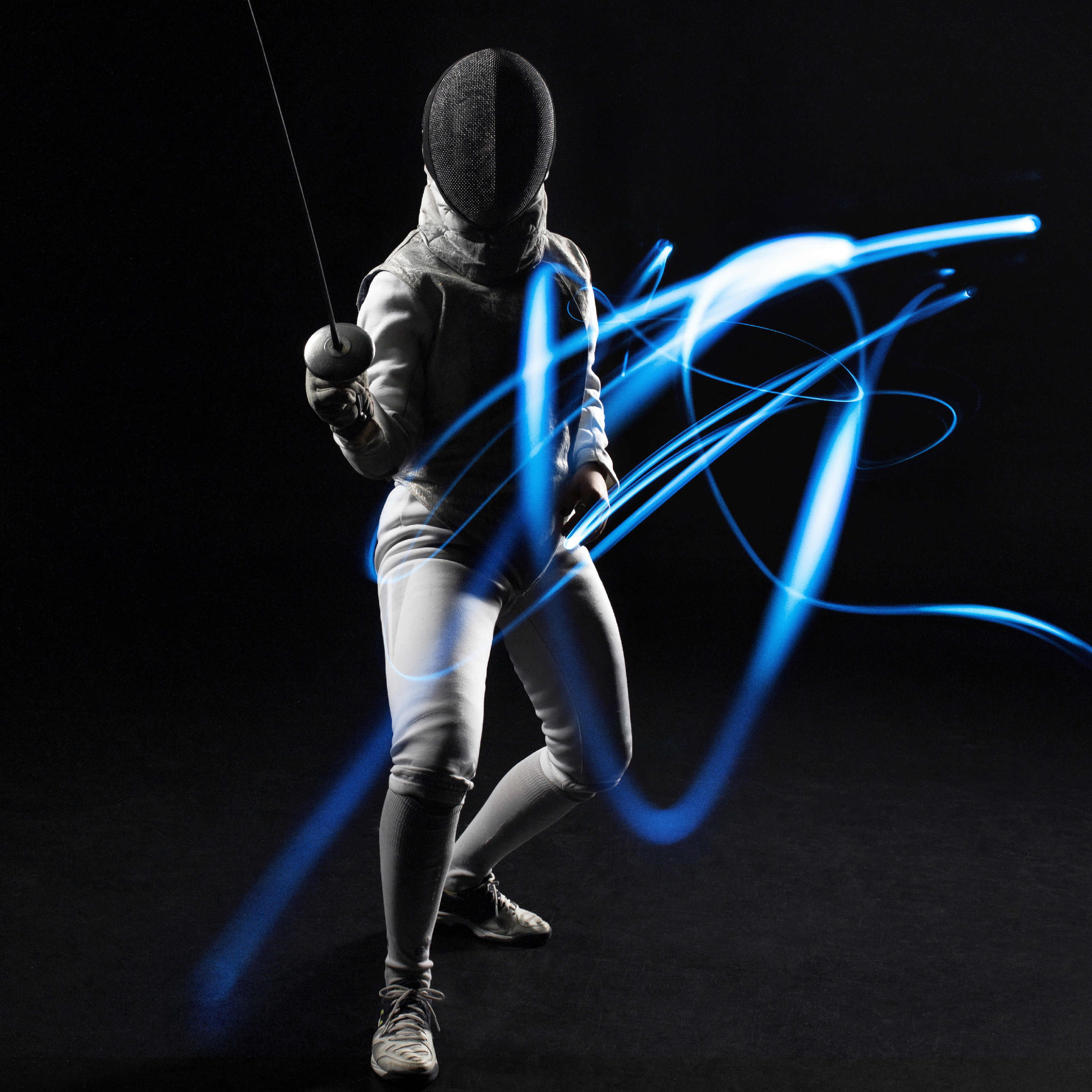
Our premise for Criticalis born through conversations with the client and DNA development was to imagine them as the masters of cyber security – a craft that they had honed, an art that they were masters of. Agile and quick thinking like an elite fencer, countering attacks and always thinking ahead of their opponent’s next move. 'En garde' 24/7, simply uncompromised.
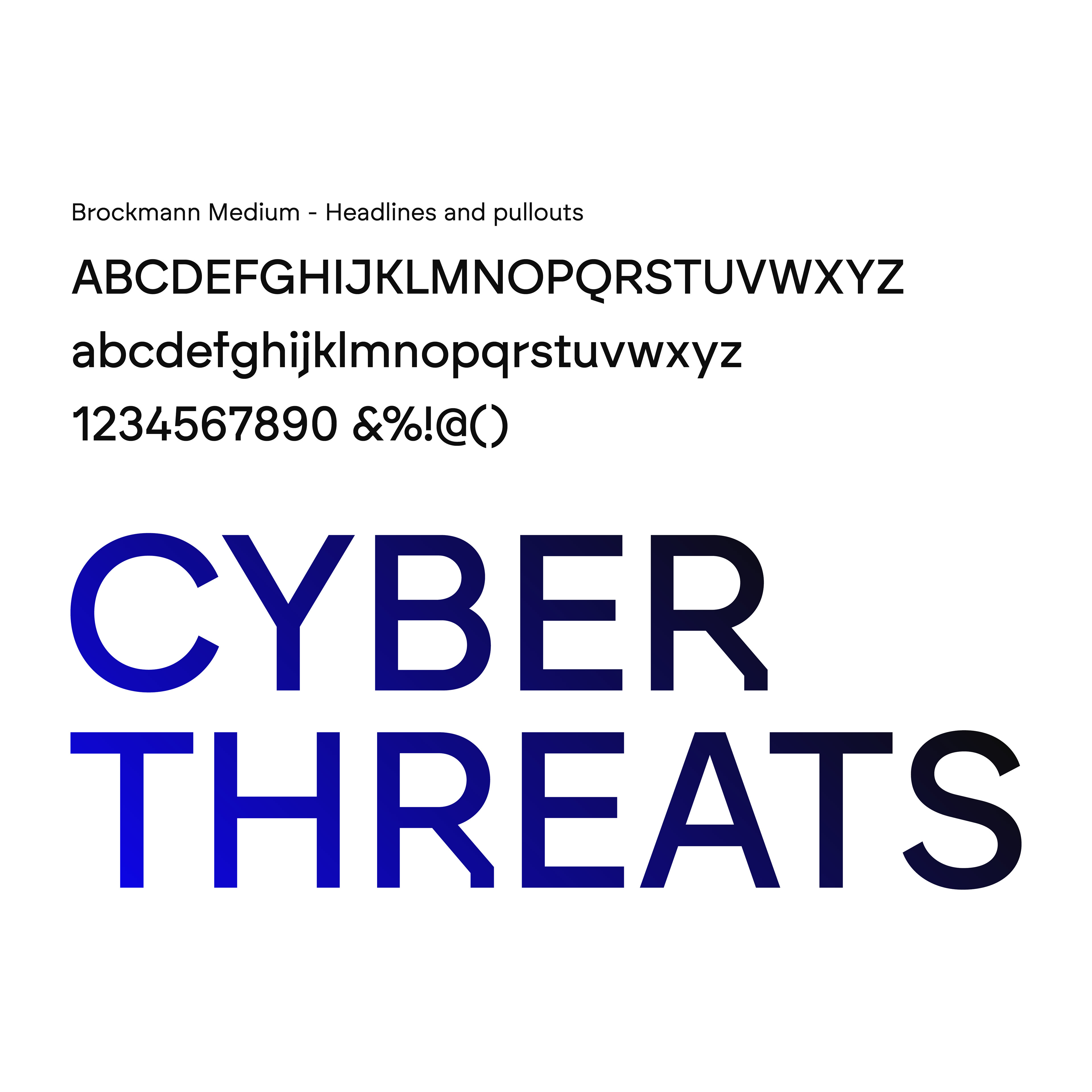
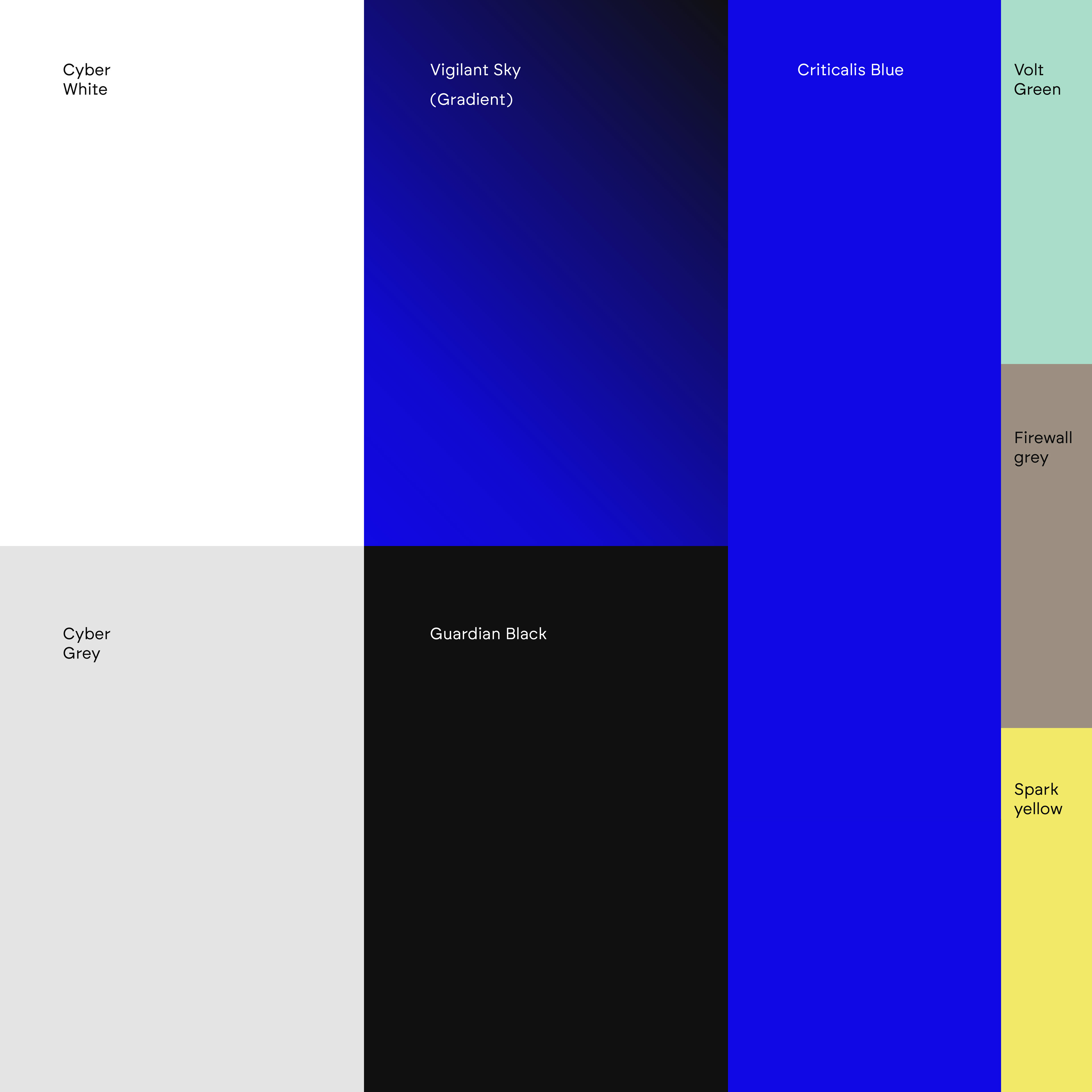
This story was then brought to life through a new logo, colours, font, symbols, a set of graphic devices and buttons, bespoke icons and imagery. These formed the brand toolkit along with styling guides, copywriting guidance, website, social and brochure visuals. Creative direction was given to the web developer and copywriter.
At Sellick Creative we believe for the creative to be strong and have legs to carry it forward there must be a great story that sits behind everything to feed the creative thinking and give visual and tone of voice direction.




The Criticalis Cross.
Inspired by crossed swords it depicts two aggressor blades successfully guarded by a blue shield. The sharp angles reference those seen in the typeface. This thinking has also been employed across the creation of all the graphic elements and icons.
The shape can be used as a texture in a multiple wallpaper style shown bottom or as larger shapes in small clusters or single symbols. See visuals for inspiration.