Task
Create a fresh new look for Beefeater to appeal to a younger audience whilst not alienating its traditional customers.
Solution
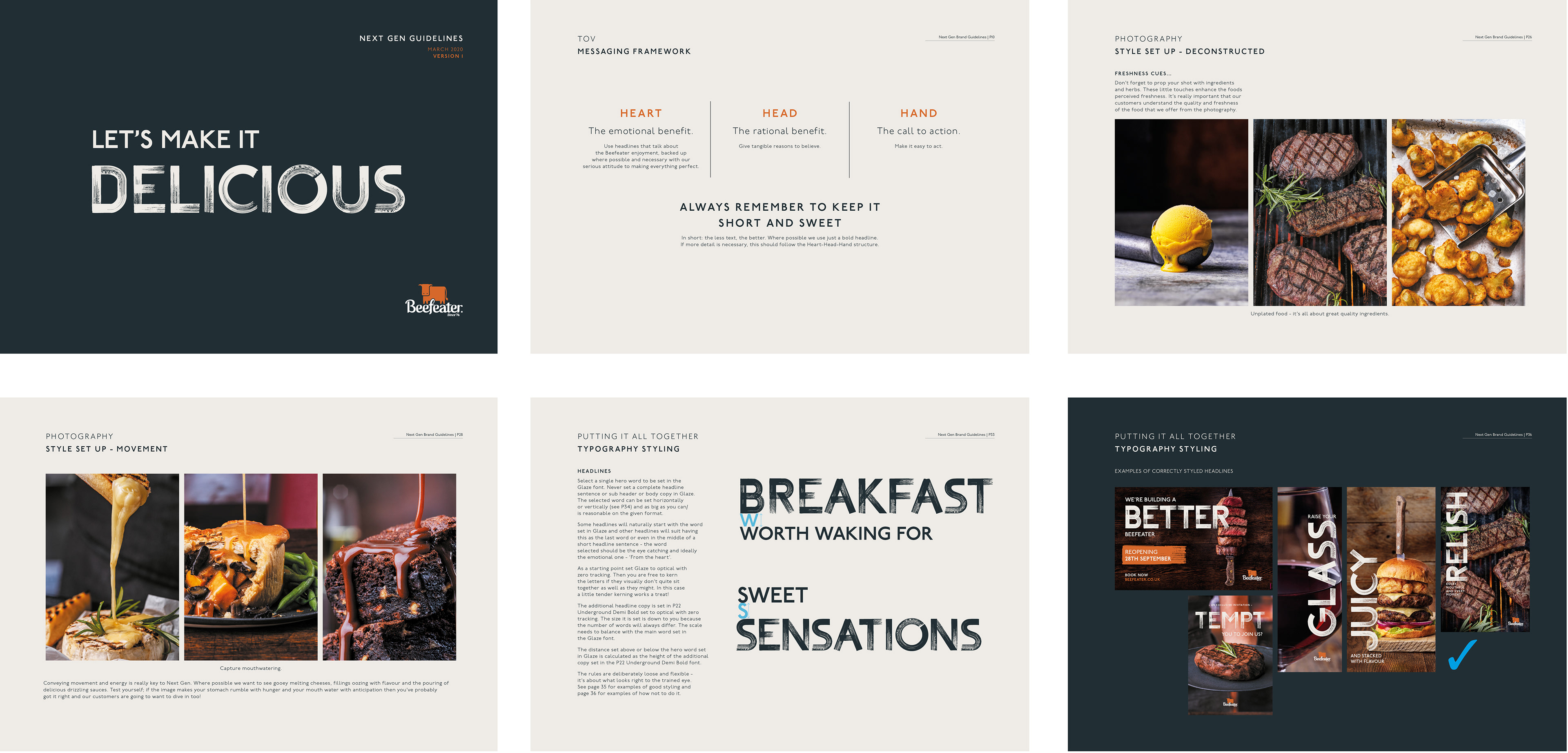
I looked at Beefeaters customer insights and its food offering and how it plans to develop it's menu across a gradual roll out of newly refurbished restaurants (Next Gen). This research and understanding helped me to develop a new photography style that focuses on the quality ingredients. Food is hero and is supported by equally fresh copy in a bold move away from previous menu's and marketing communications.
A new typeface 'Glaze' was cut to work with the imagery and the Language is both fun and approachable. Headlines are supported with provenance RTB's where appropriate.
The messaging is engaging but deliberately not highbrow, just like Beefeater. The combination of new imagery and copy have started a refresh for the brand.
A new platform was created from which stories can be told whilst not forgetting a brand that has a 40 year heritage and an estate of 120 restaurants.
Before getting the font professionally cut I carried out some tests and created an alphabet on my iPad Pro.
The 'Nextgen' brand coming to life within the restaurant environment
Postioning statement
AT BEEFEATER, GRILLING IS AN ART AND A RITUAL. DRIVEN BY OUR EXPERTISE IN STEAK, WE’VE DEVELOPED A MENU WITH SOMETHING FOR EVERYONE. WHETHER IT’S A TENDER STEAK, A JUICY BURGER, A TASTY SALAD, AND INDULGENT DESSERT OR A FEW REFRESHING DRINKS.

Page selection from the Beefeater 'Nextgen' guidelines
Credit: Clarity